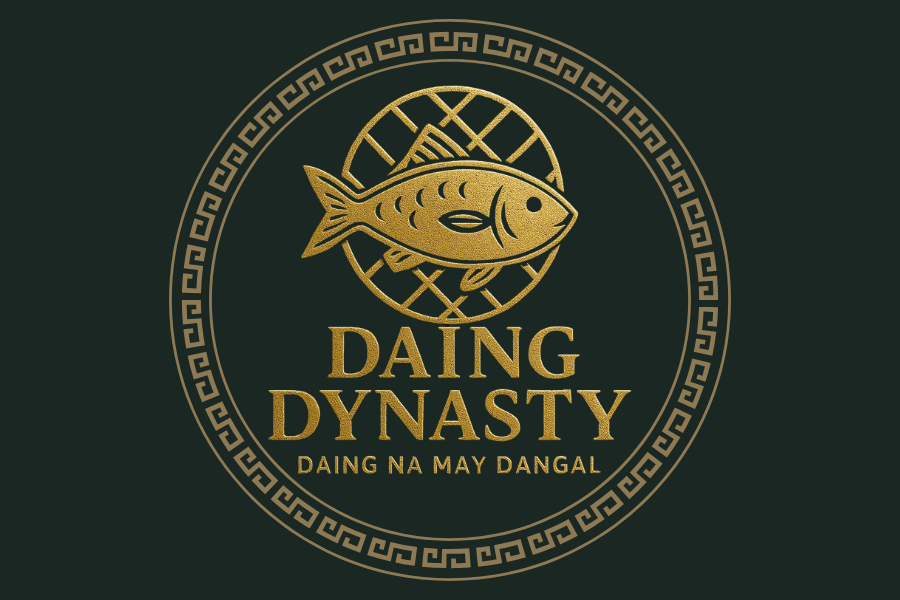
Daing Dynasty Logo
Karmee Trinette AmansecShare
* The Color Palette: Royal Green and Gold
We chose a deep, royal green to symbolize the natural wealth of the Philippine islands—its lush landscapes and bountiful waters. The elegant gold accents represent quality, excellence, and the value we place on our culinary traditions. It’s a combination that says "premium" and "heritage."
* The Name: "Daing Dynasty"
"Daing" is a beloved Filipino method of preserving fish, a testament to our resourcefulness and ingenuity. "Dynasty" speaks of legacy, tradition, and passing down something of great value from one generation to the next. Together, they represent a legacy of authentic Filipino flavor.
* The Tagline: "Daing na may Dangal"
This is the heart of our brand. In English, it means "Dried Fish with Honor/Dignity." We aim to elevate this humble Filipino staple, showing that it can be presented with pride and excellence. It’s our promise of quality and respect for the food we offer.
* The Central Fish Icon
Simple, classic, and honest. The icon immediately tells you what the product is, but its clean, stylized look honors the daing in a sophisticated way, moving it from a simple commodity to a celebrated product.
